What Is Responsive Web Design and Why Does Your Small Business Need It in 2025?
responsive web design , small business website , mobile-friendly website , website redesign 2025 , Debtech LLC , SEO web design , user experience , mobile optimization , website conversion , responsive design benefits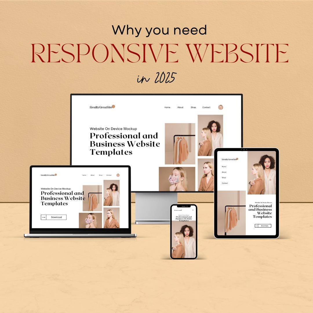
It's 2025. If you're running a small business and your website still isn't responsive, you're probably losing potential customers every single day. I'm saying this from experience. After years of working with local businesses—from boutique shops to service providers—I've seen what happens when a website just doesn't work on someone's phone. They leave.
Responsive web design means your site automatically adjusts to whatever screen someone's using. Desktop, laptop, tablet, phone. It doesn't matter. The site bends, resizes, and rearranges itself to make everything readable and clickable. Simple as that.
But here's the thing. It's not just about looking nice. It's about how people find you. It's about staying on Google's good side. And it's about keeping your visitors long enough to take that next step—book, buy, call, sign up. Whatever your goal is.
So What Exactly Is Responsive Design?
Picture this: You click a link on your phone. It opens a webpage with tiny text, buttons that don't work unless you zoom in, and a layout that looks like it was made in 2003. You leave, right?
That's what happens when a site isn’t responsive.
A responsive website changes based on the device. It shifts layouts. It resizes images. It stacks content in a way that makes sense on small screens. There’s no separate mobile version. It’s one site that works everywhere.
And as someone who's spent years optimizing sites, I can tell you this: it’s way easier to manage one smart site than to juggle two or three outdated versions.
Google Changed the Rules—And They’re Not Going Back
Back when I first started in digital marketing, you could get away with a clunky mobile site. Not anymore.
Google now prioritizes the mobile version of your site when deciding your search ranking. That means if your site stinks on a phone, your visibility drops—even if your desktop version is top-notch.
I've seen this happen. I had a client—a home services business—who couldn't figure out why their traffic dropped. Turns out their site looked fine on desktop but was a mess on phones. We redesigned it responsively, optimized the content, and within weeks their rankings bounced back. Calls started coming in again.
Why? Because responsive design helps with:
- Speed: Mobile users are impatient. If your site takes too long to load, they’re gone.
- Structure: Google likes clean, crawlable code. Responsive design helps with that.
- User Behavior: Google tracks how long people stay on your site. If users bounce, that’s a red flag.
Bottom line? A responsive website doesn’t just look better. It performs better.
Your Visitors Are Judging You—Fast
You have about 3 seconds to make a good impression. That’s it.
When someone visits your site, especially from a phone, they need to feel like:
- They’re in the right place
- It’s easy to find what they need
- The business looks trustworthy
I once worked with a bakery business that had an amazing product but a clunky site. We made it responsive—big, beautiful images, easy tap-to-call buttons, and fast-loading menus. Orders went up. People even said, “Your new website is great!” in customer reviews. That’s how real the impact is.
People don’t want to struggle to navigate through your website. They want to book a service. Buy a product. Read a menu. If it’s hard, they move on.
All Roads Lead to Growth
Here’s how it all connects:
- Responsive design makes your site mobile-friendly
- Mobile-friendly means better rankings on Google
- Better rankings = more people find you
- Better experience = they stay longer and take action
It’s a cycle that works in your favor.
Whether you're a local gym, a dog groomer, or a freelancer, your website is often the first place people meet your brand. A smooth, fast, and friendly site builds trust fast. And trust drives sales.
One Site to Rule Them All
Managing multiple versions of a website is like juggling flaming torches. Stressful and unnecessary.
Responsive design means:
- One site to maintain
- One set of analytics to track
- One clear customer journey to improve
When I help clients build a site from scratch, we don’t even consider a non-responsive option. It just doesn’t make sense anymore.
And here's another win: Responsive design is ready for the next big thing. New screen sizes, wearable tech, foldable displays—whatever comes next, a flexible layout keeps up.
What Happens If You Don’t?
You may think your current site is "fine." But "fine" doesn’t cut it.
Here’s what you risk:
- High bounce rates from frustrated visitors
- Lower visibility in search engines
- Fewer conversions from your marketing efforts
- A bad impression of your brand
And here’s something people don’t talk about: You could be paying for ads that send people to a site that doesn’t work. That’s literally wasting money.
I’ve had clients come to me saying, “We’re running Google ads but getting no results.” And nine times out of ten? The landing page isn’t responsive.
Want to Know If Your Site’s Responsive?
You don’t need to be techy. Just try this:
- Open your site on your phone
- Check how fast it loads
- Try reading the text—no zooming allowed
- Try tapping the menu, buttons, or links
- See if images are cut off or misaligned
If anything looks or feels off, you’ve got work to do.
Tools like Google’s Mobile-Friendly Test can also give you a simple pass/fail grade. But trust your eyes, too. If you wouldn’t want to use your own site on your phone, why would a customer?
Tips for Getting It Right
You don’t need a massive budget to build a solid responsive site. Here’s what I usually suggest:
- Start with a good platform: WordPress, Squarespace, Webflow, they all have responsive templates.
- Don’t go overboard: Keep your layout simple and clear.
- Test as you build: Always check your site on real phones and tablets.
- Don’t forget speed: Compress images and use smart hosting.
- Work with someone who gets it: You don’t have to do it alone. Partner with someone who’s helped others do it before.
In the End, It’s About Respect
Think of it this way—someone took time out of their day to visit your site. Don’t make them work for it.
A responsive site says, "Hey, I see you. I’m here for you. No matter what device you're on."
It’s a small detail that speaks volumes. And in 2025, it’s the detail that makes all the difference.
As someone who’s seen the before and after, I can promise you—it’s worth every minute of effort.
Make your website easy to love. And let the rest take care of itself.
FAQ: Responsive Web Design for Small Businesses
1. How much does it cost to get a responsive website?
It varies depending on your needs, but basic responsive redesigns can start at around $1,500. Full-service builds with SEO can range from $3,000–$10,000+. At Debtech LLC, we offer flexible packages based on your goals.
2. Will I have to rebuild my entire website?
Not necessarily. If your current site is on a platform like WordPress, a theme and plugin update might be all you need. But in some cases, a fresh rebuild gives better long-term ROI.
3. How long does it take?
A typical responsive redesign takes 4–8 weeks, depending on content, features, and feedback cycles.
4. Is responsive design the same as mobile-friendly?
Not quite. Mobile-friendly means it works on mobile, but not necessarily well. Responsive means it adapts beautifully to all screens—from 4-inch phones to 32-inch monitors.
Call to Action: Ready to Make Your Website Work Harder?
Your website is often the first impression your business makes. Let’s make it unforgettable—and functional.
If you’re a small business ready to compete in 2025 and beyond, Debtech LLC is here to help you build a website that performs just as great as it looks.
Contact Us Today for a Free Website Audit
See Our Web Design Portfolio
Get a Quote for Your Responsive Redesign
Final Thoughts: Invest Now, Reap Later
The world is going mobile, and your business needs to go with it. A responsive website isn’t just about tech—it’s about trust, conversions, and giving your visitors a reason to stick around.
Responsive web design is no longer a trend. It’s the standard. And in 2025, your small business can’t afford to get left behind.